Midnight Harbour
A detective thriller concept built around one light source
What the concept set out to do
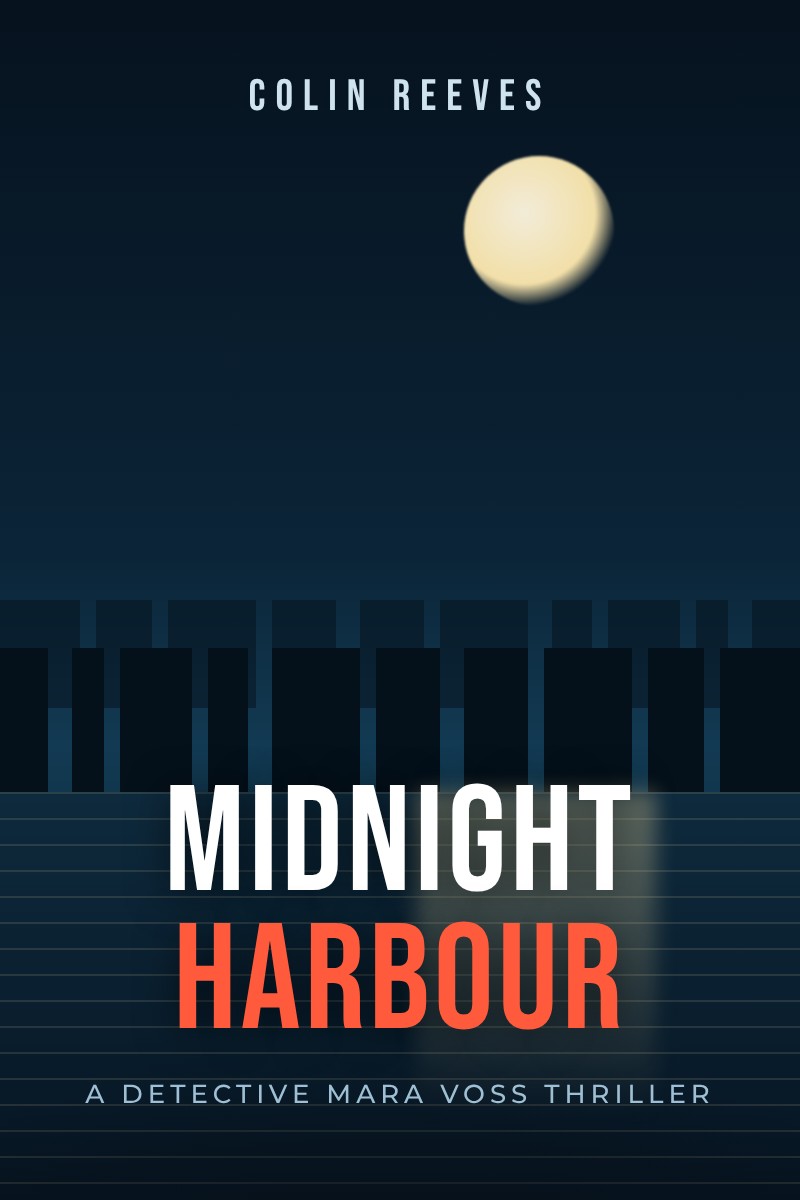
Design a front cover for a crime thriller set in a port city. The reader should feel the cold and the quiet of the harbour at night, and the title treatment should hold its own at thumbnail size on a phone.
Design decisions
- The whole image is organised around a single moon and its reflection, so the eye lands on the title and then drops to the water.
- A condensed sans serif in two colours lets the second word carry the genre: the red of Harbour reads as danger without a single drop of blood.
- The skyline is kept to pure silhouette, which prints cleanly on matte stock and avoids muddy detail at small sizes.
- A small series line at the foot leaves room for a sequel treatment without redesigning the cover.
How a dark cover can stay legible on store pages, and how typography alone can signal a thriller.
Deliverables shown in this concept
- Front cover concept
- Thumbnail test at 80 pixels wide
- Colour variants for a series
Books A Nation's contribution to a studio concept is the whole design: concept, typography and artwork. For client books, our contribution is stated on each project only once the author has confirmed it.
Want this approach on your own book?
Our cover design and illustration service starts with a brief like the one above and ends with files you own.
Related reading: How to prepare a book cover brief your designer can actually use